
BridgePhase
Branding, Website Design, Print Design, Social Media, Presentations


Purpose built. Mission proven.
BridgePhase is a cutting edge digital services company that creates intelligent digital solutions for critical missions in the government sector.
However, their external brand didn't quite reflect the sophistication of their work or the energy of their internal culture. We stepped in to close that gap by designing a refreshed visual identity and an entirely new sub-brand that signaled their innovation and agility.
To ensure long-term brand equity, we also built a suite of intuitive templates that empowered their internal team members to seamlessly produce new, consistent collateral that stays perfectly aligned with their new brand standard.
Brand Refresh Process
Discovery
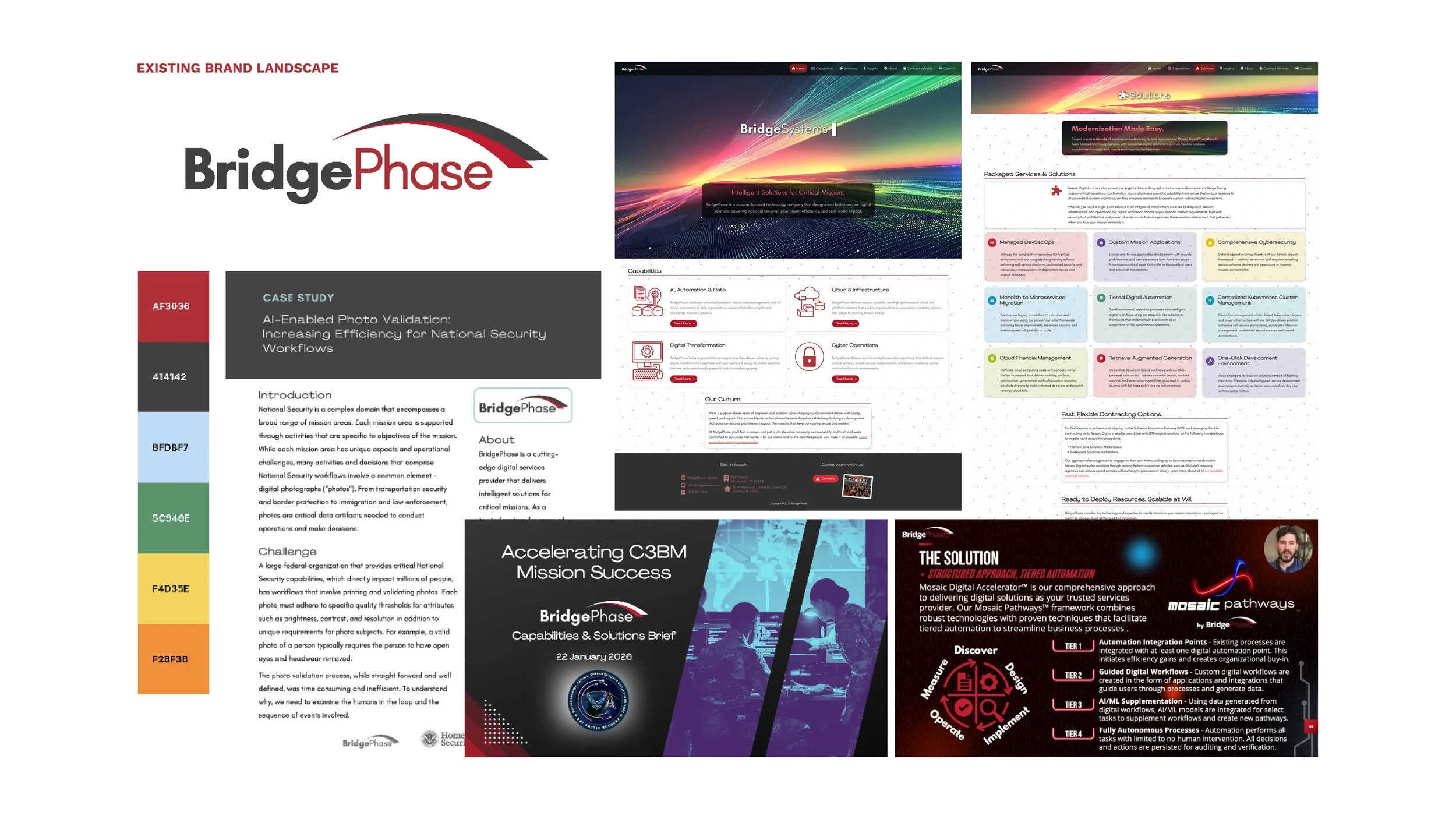
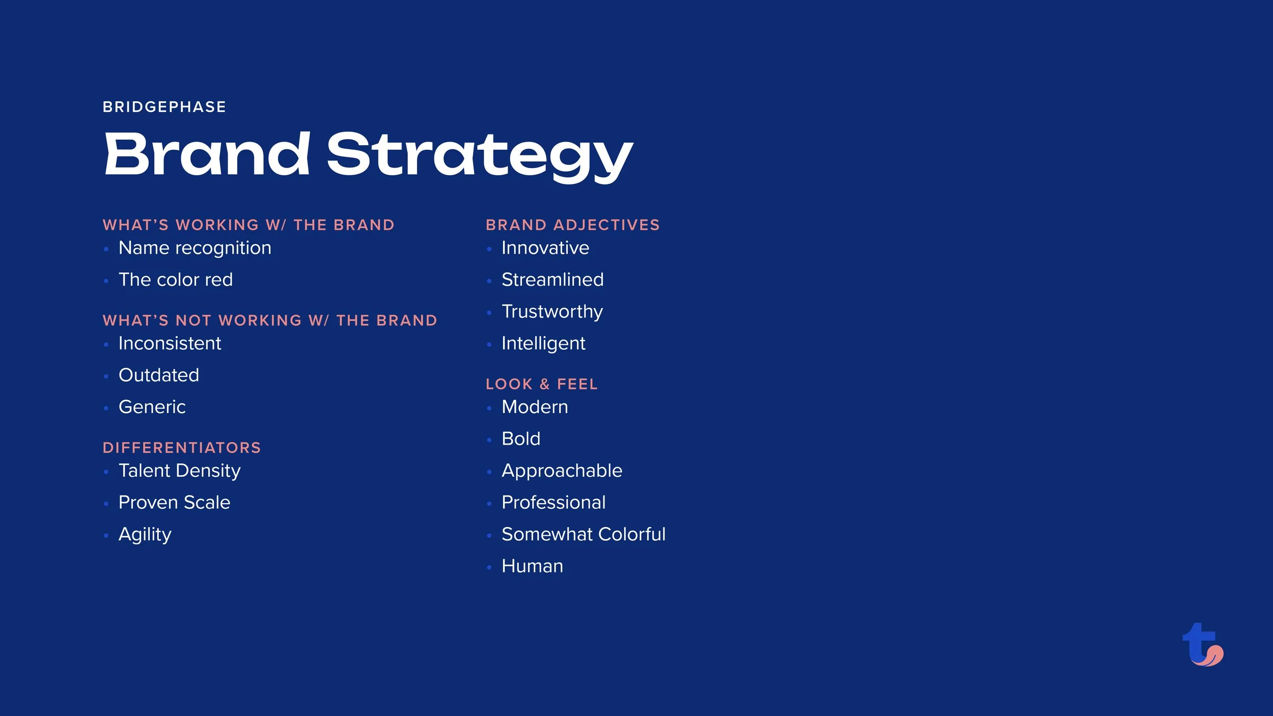
Before design work began, we conducted team member interviews, a competitive analysis, and a deep review of BridgePhase’s existing brand. This research lead us to a recommended brand strategy that outlined what was working well with the current branding and what wasn’t, as well as their key differentiators. This research fed directly into a set of key brand terms that functioned as guiding principles for the work ahead.
Concepts
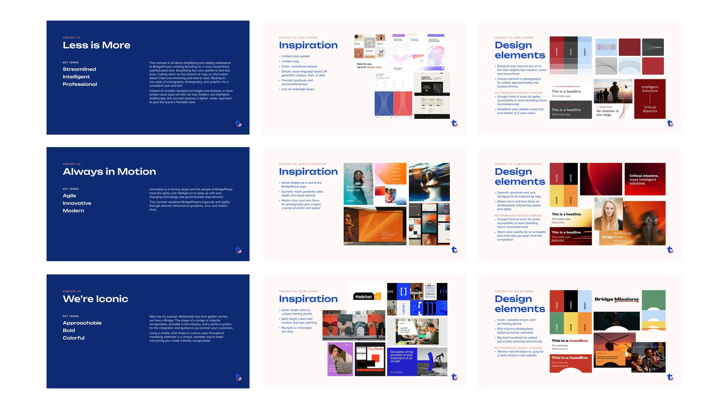
Research done in the Discovery phase lead us to three initial visual directions presented as inspirational moodboards and uniquely BridgePhase design elements.
Refinement
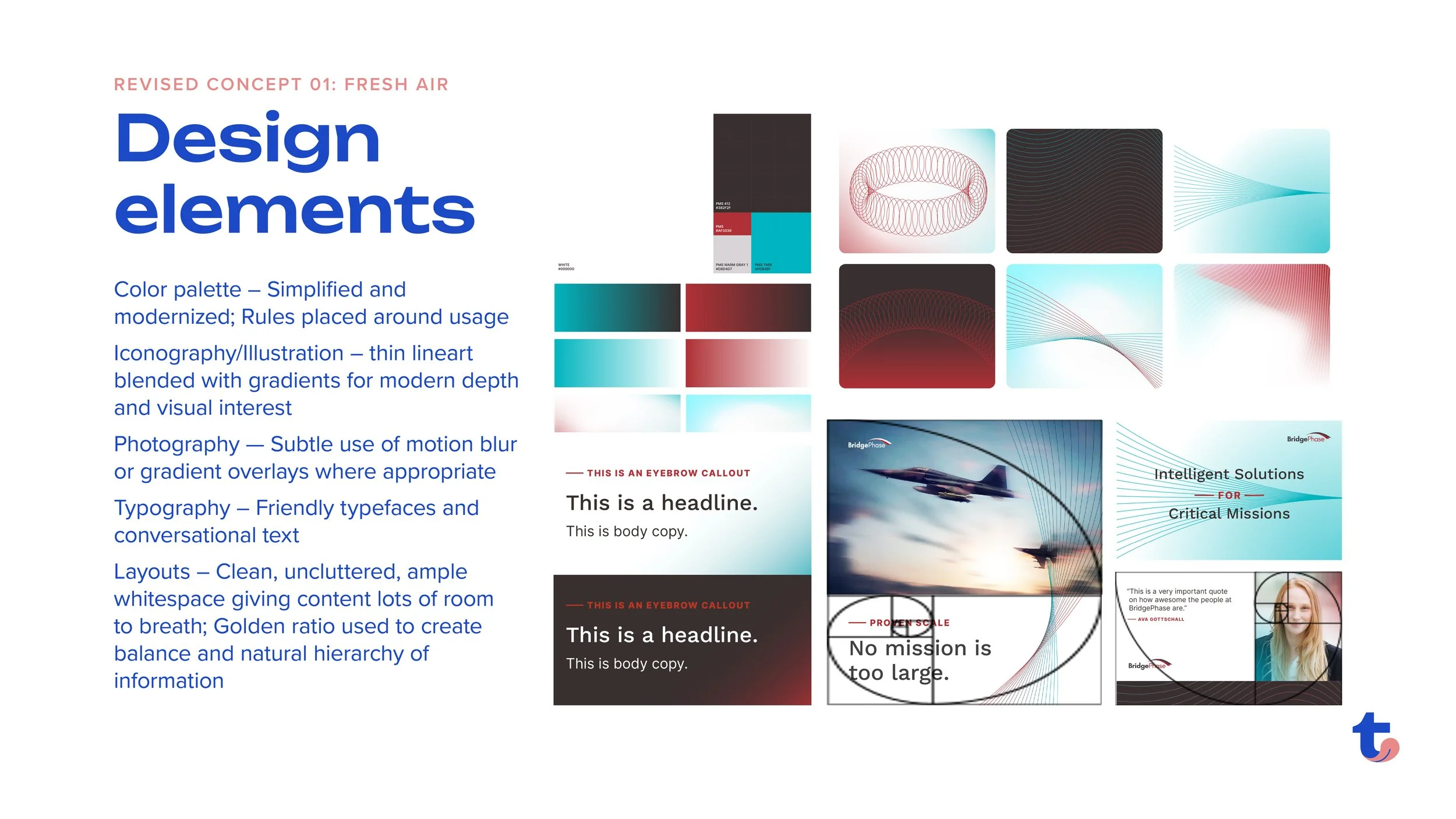
After reviews and discussions with the internal BridgePhase team, we refined down into one strong visual direction that successfully breathed new life into their previous branding. This included a simplified and evolved color palette, an ownable layout and color strategy, conversational text, energetic lineart illustrations and icons and unique motion blur photography.
Expansion
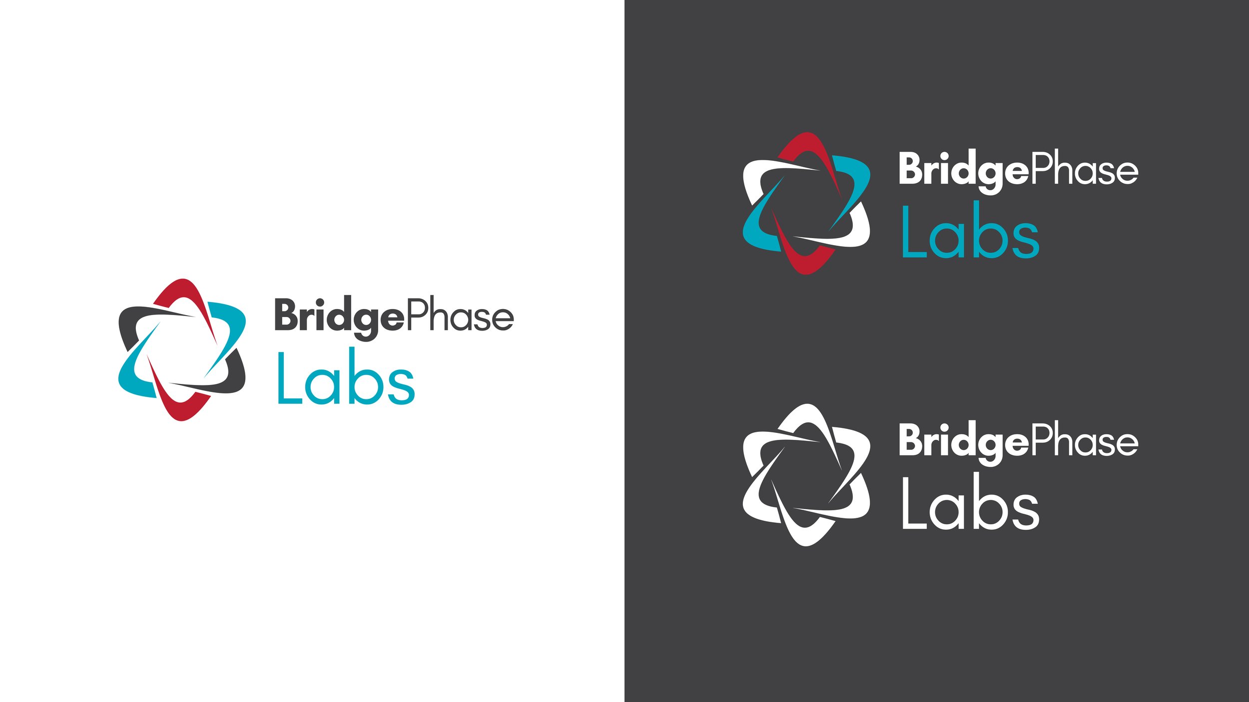
In addition to the brand refresh, BridgePhase was also launching a new division called BridgePhase Labs that needed a sub-brand, product naming and product branding. We explored different sub-branding approaches and ultimately landed on a mark built from BridgePhase’s main logo elements. From the arches comes a spinning atom — the foundation of matter and spirit of exploration, intelligence and curiosity.
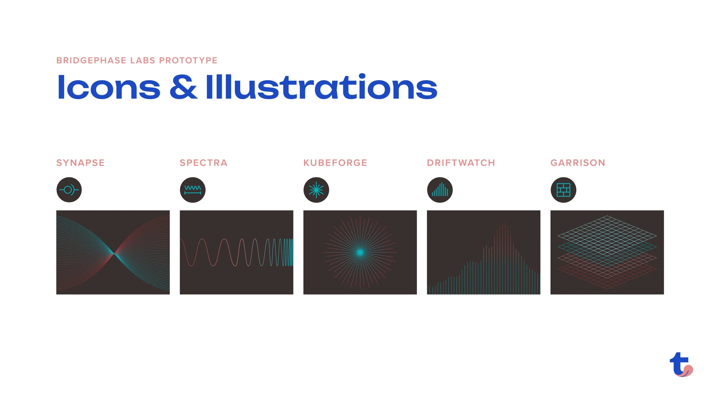
For the product naming we enlisted the support of our favorite writer, Arye Dworken, to help us brainstorm product names that aligned with the S.T.E.M theme we were going for with the branding. With those names we created custom line illustrations and icons to represent them visually.
The Labs sub-brand also integrated different uses of the full brand color palette (more use of teal and dark gray backgrounds) to clearly indicate they were doing things differently in the Lab.
The Finished Product
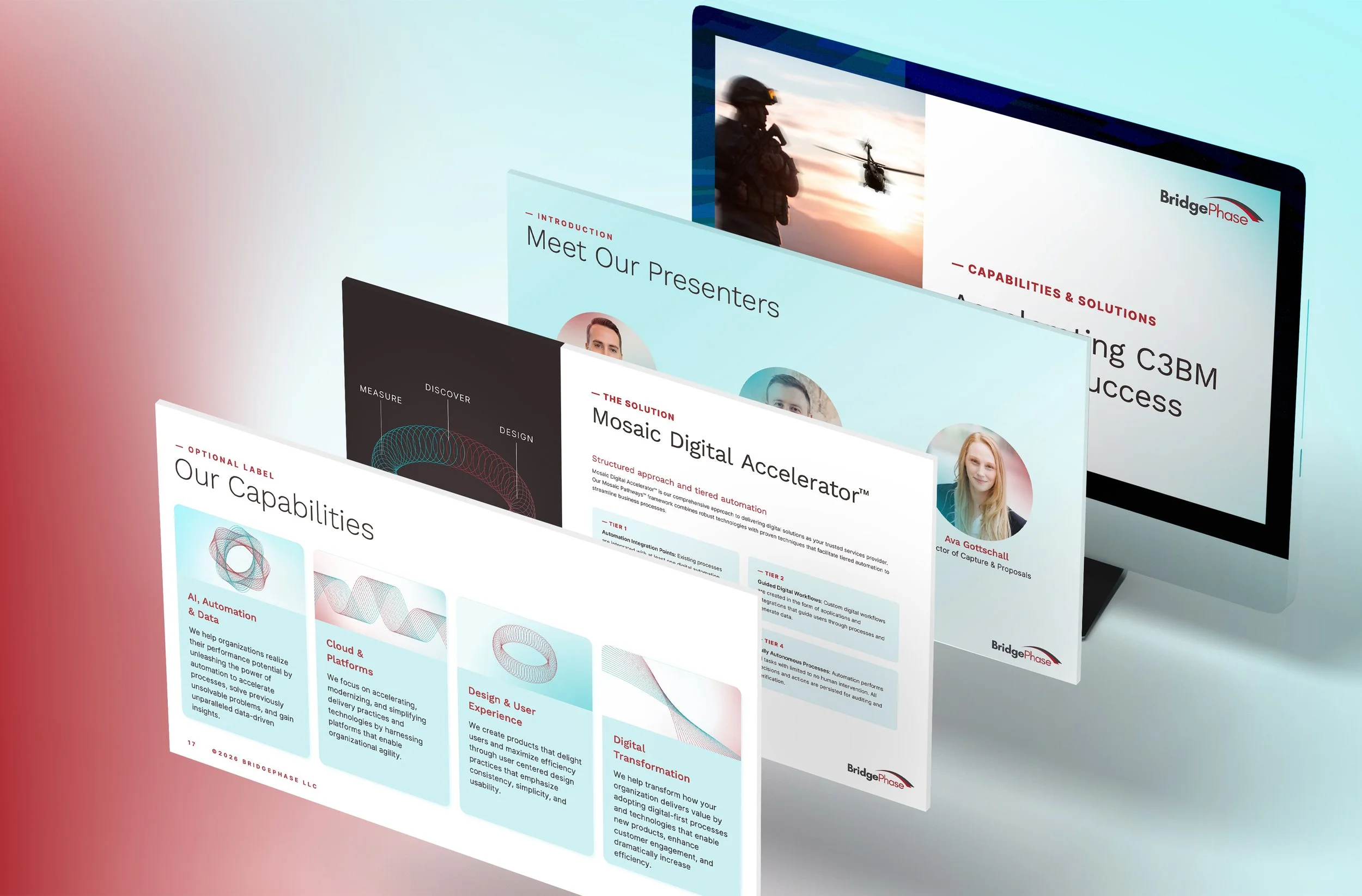
Presentation Template
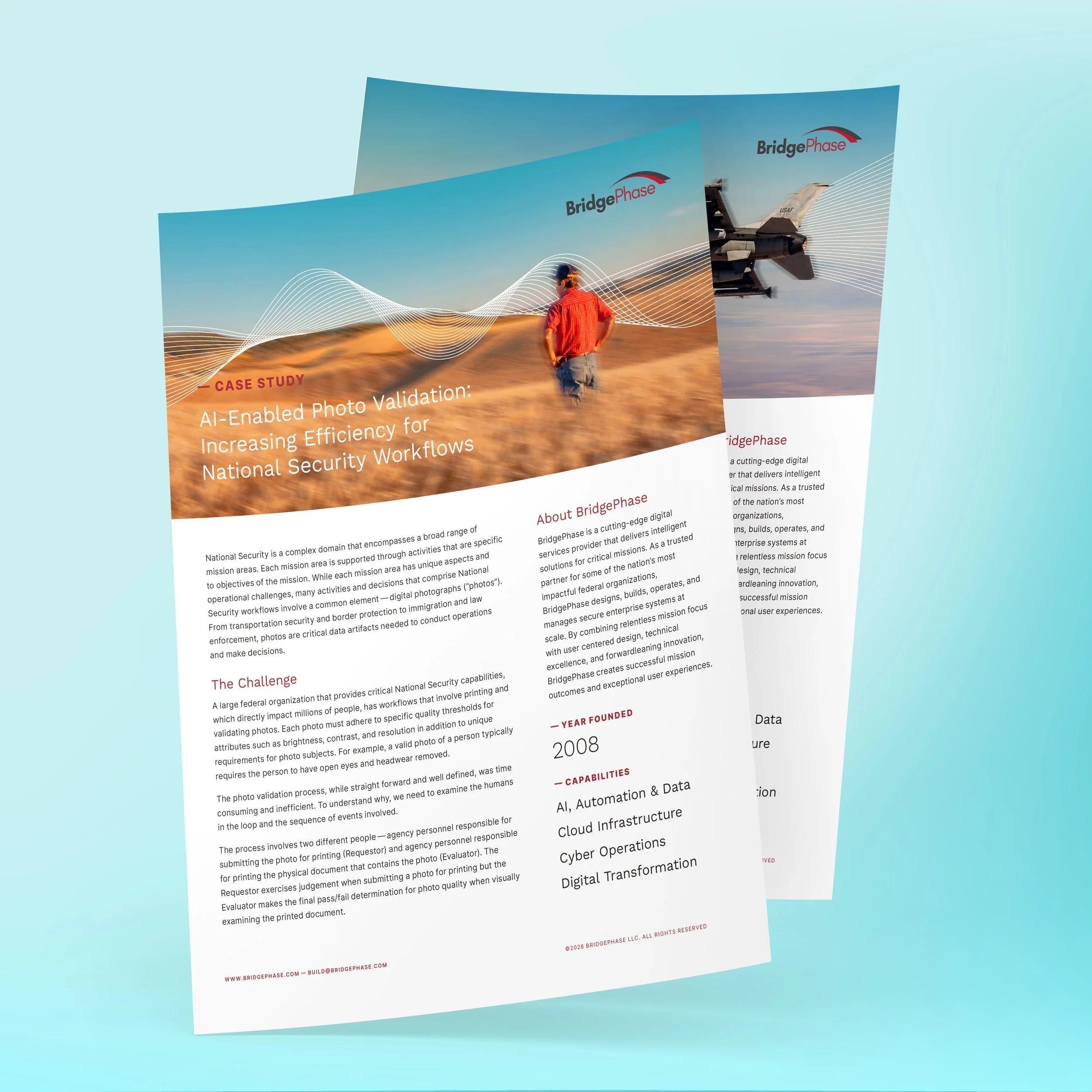
Document Template
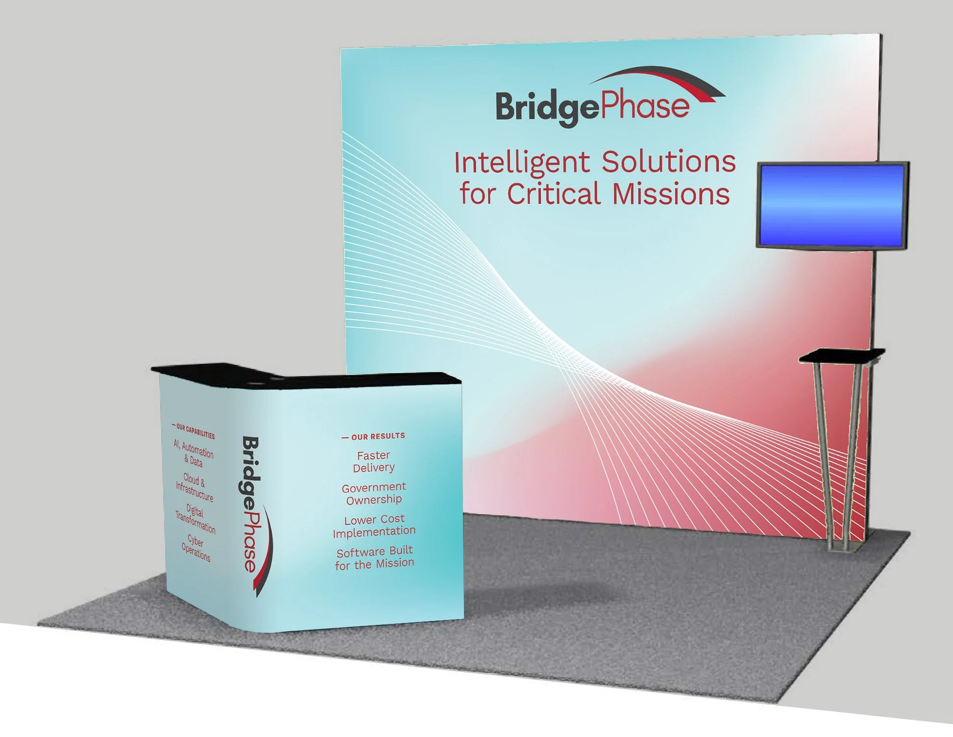
Tradeshow Booth
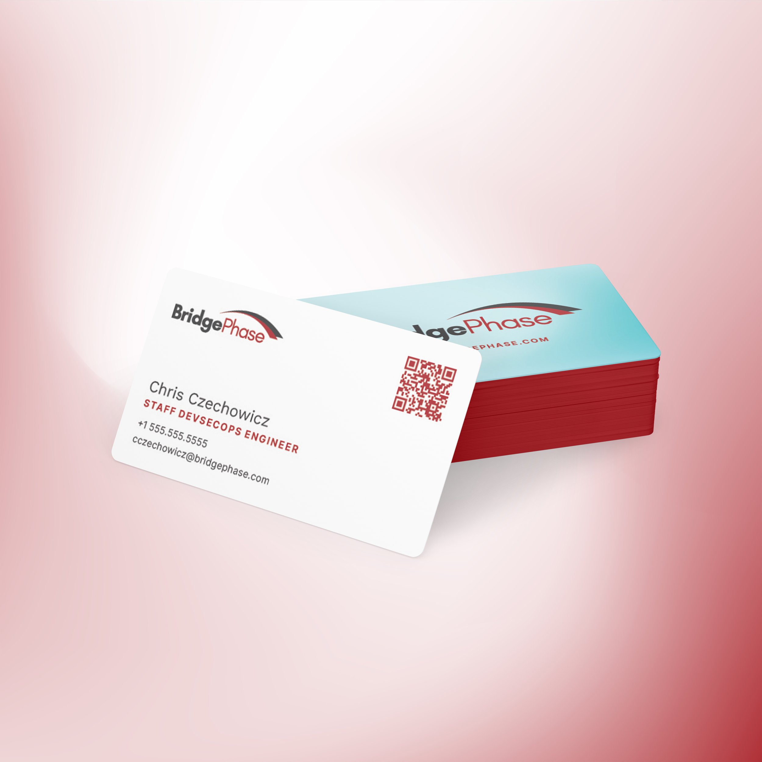
Business Cards
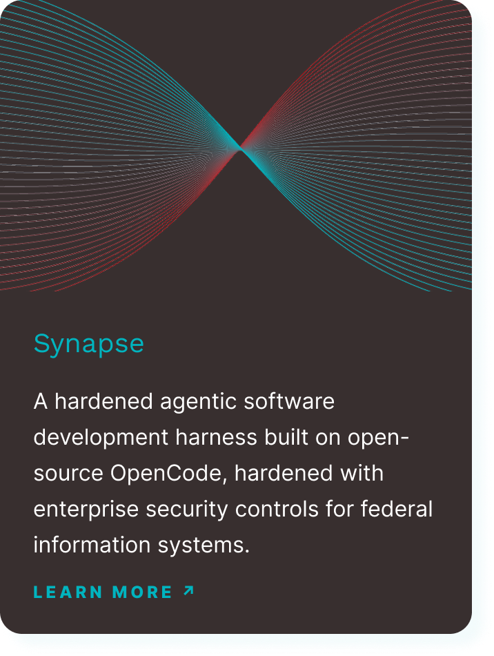
Labs Prototype Tile
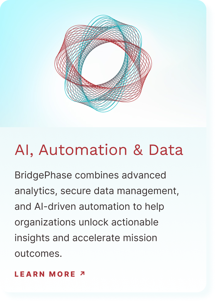
Capability Tile
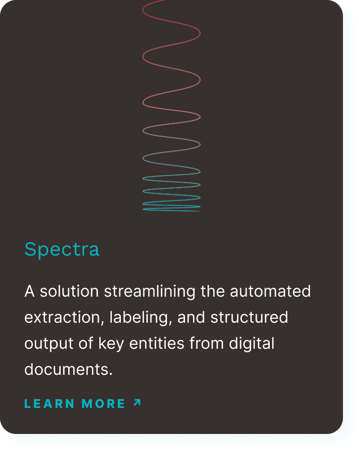
Labs Prototype Tile
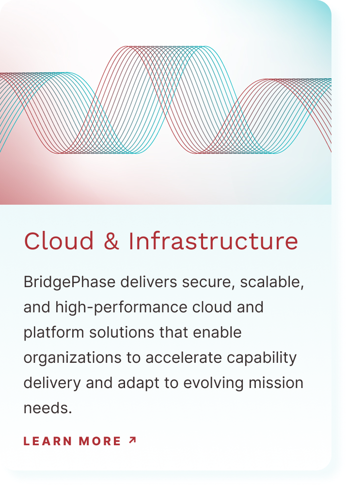
Capability Tile
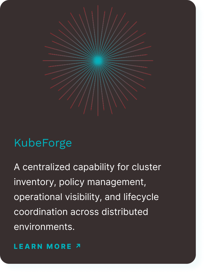
Labs Prototype Tile
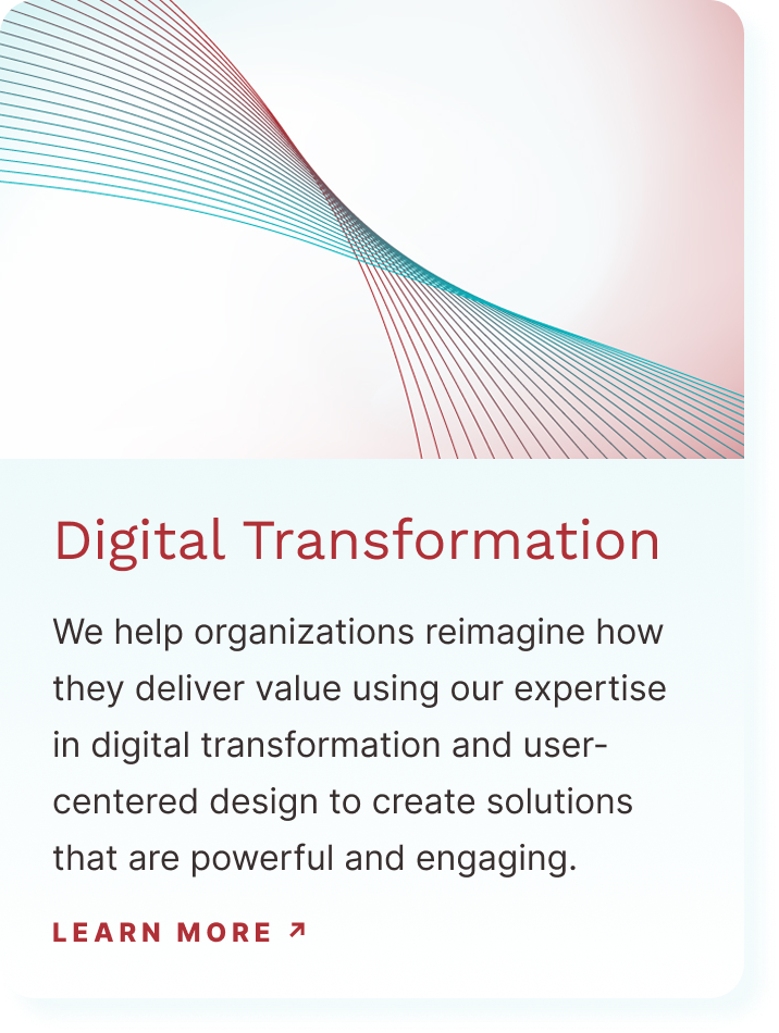
Capability Tile
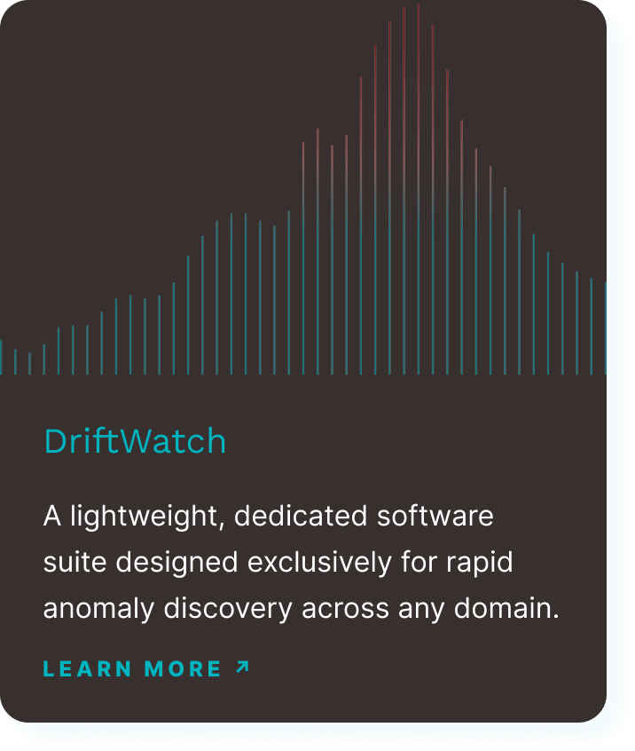
Labs Prototype Tile
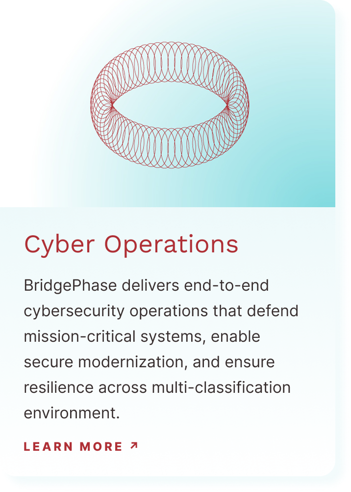
Capability Tile
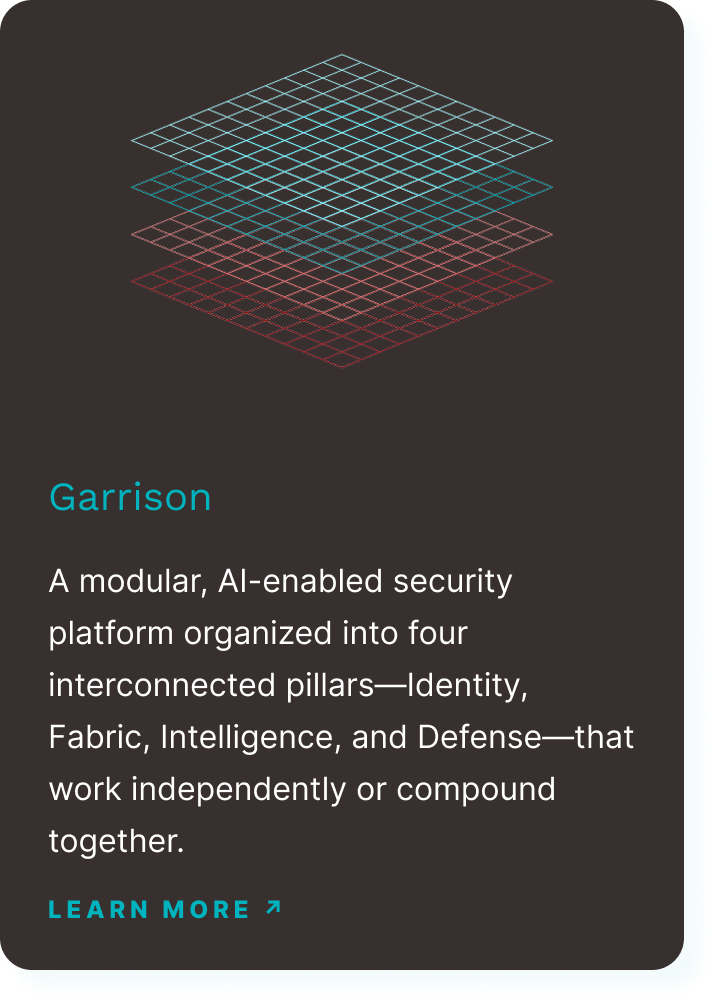
Labs Prototype Tile
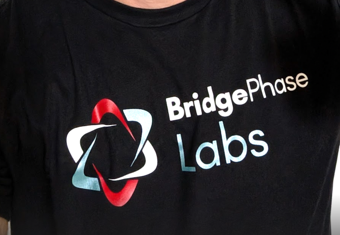
Labs T-Shirt
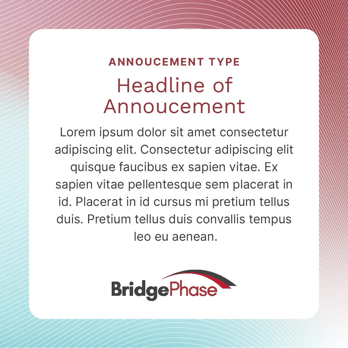
Instagram Post Template

Instagram Post Template

Instagram Post Template
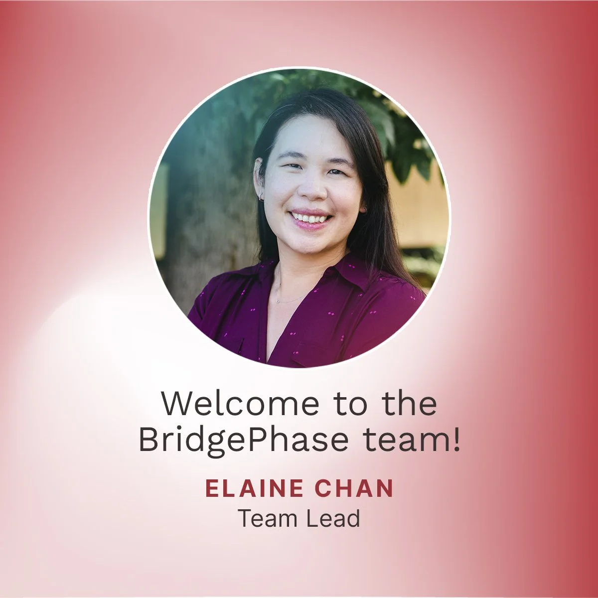
Instagram Post Template